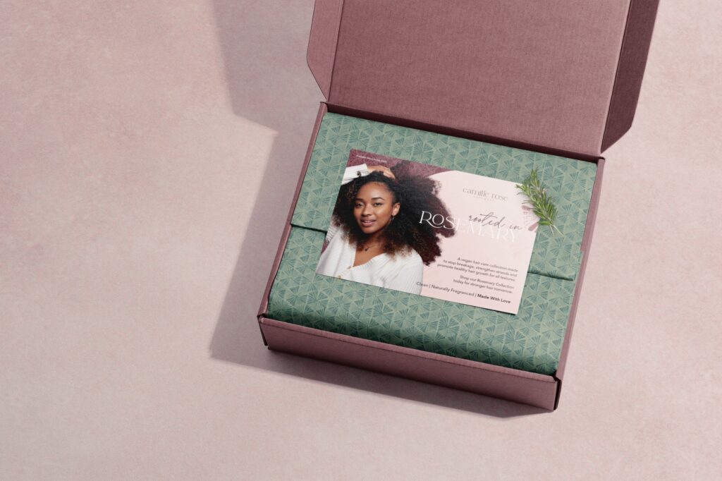
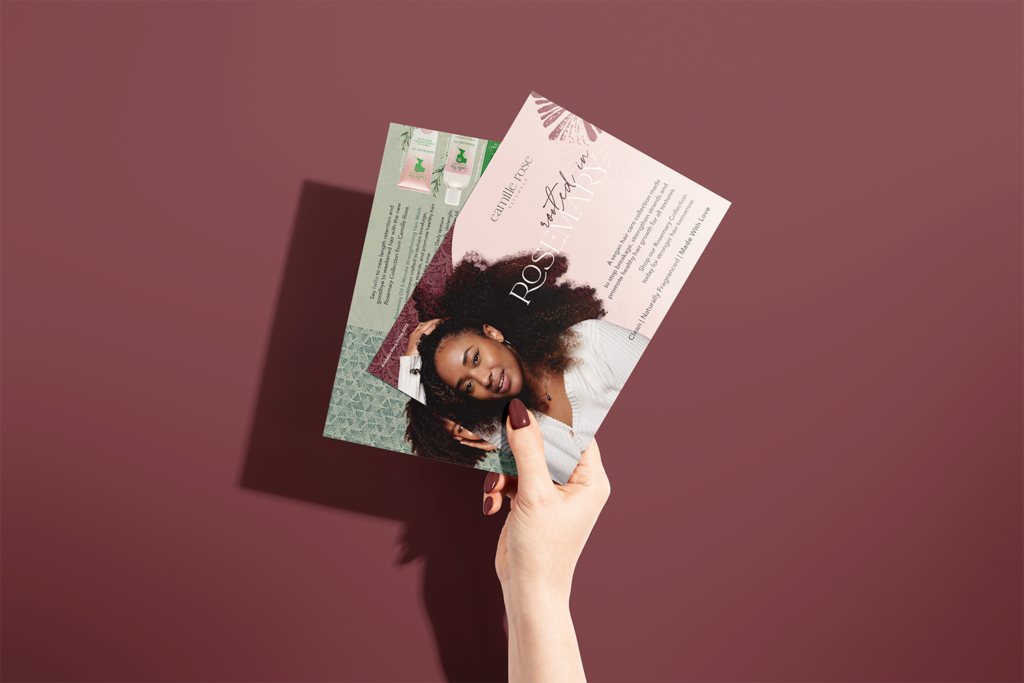
Designed a visually appealing insert that highlights the benefits of the “Rosemary Collection” with a warm, natural aesthetic, aligning with the brand’s identity. Encompassed a luxurious unboxing experience for influencers with eco-friendly materials, enhancing the brand’s commitment to natural beauty.
Role: Art Director, Graphic Designer, Project Manager
Client: Camille Rose Naturals


Design Brief:
I aimed to promote the product samples effectively while leaving a welcoming impression on influencers. The promotional insert features shapes and illustrations of rosemary sprigs and floral patterns, reflecting the natural ingredients in the products. The color scheme is inspired by the product packaging, with deeper colors added for a luxurious feel. Layering on both the front and back adds depth to the card.
Each package includes a piece of fresh rosemary alongside the new products. The insert card provides promotional information and practical ways to incorporate rosemary into daily life, enhancing the sensory experience through taste, touch, sight, or smell. This thoughtful addition aims to extend the benefits of rosemary beyond hair care to overall well-being.
Executing this concept requires precise coordination, including same-day clipping, wrapping, and shipping of the rosemary, along with a clear handling warning message. The goal is to ensure that Camille Rose’s customers not only appreciate the high-quality products but also associate the brand with warmth, care, and the philanthropic values upheld by Janell Stephens.
